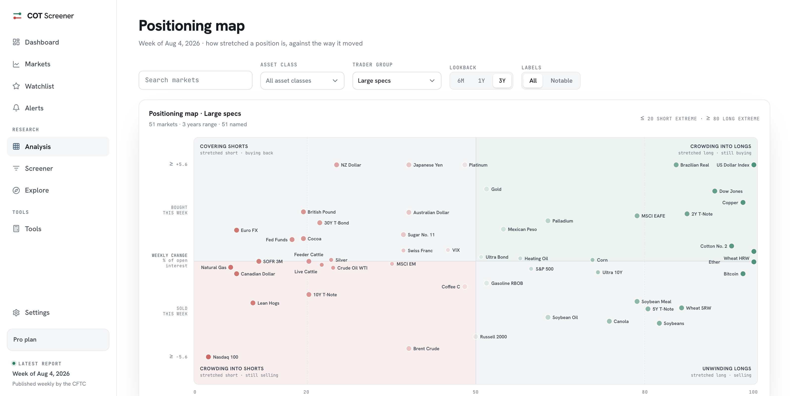
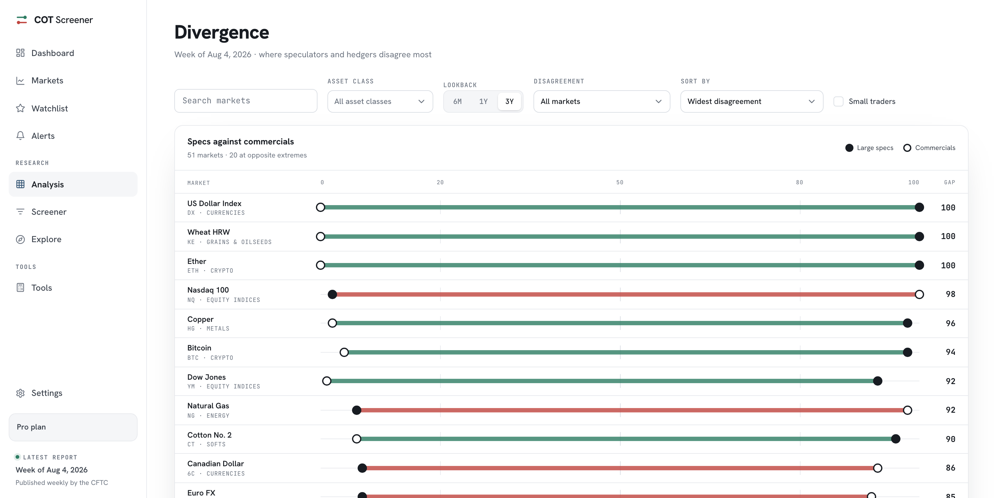
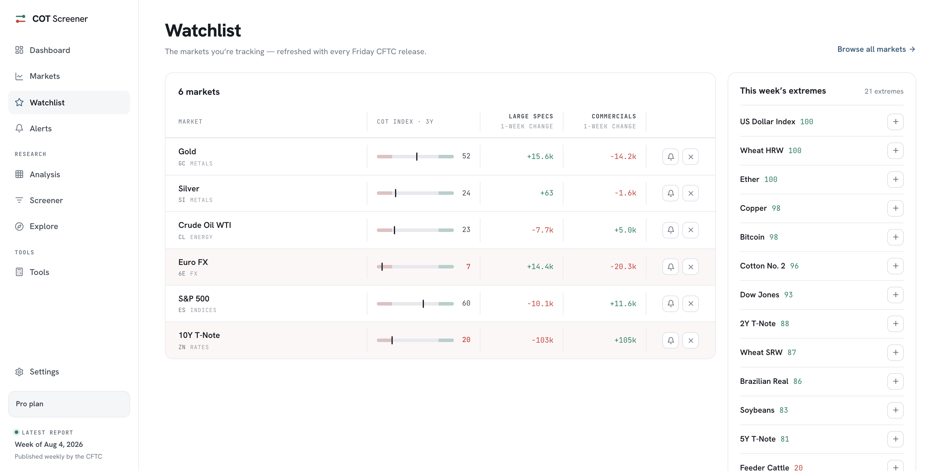
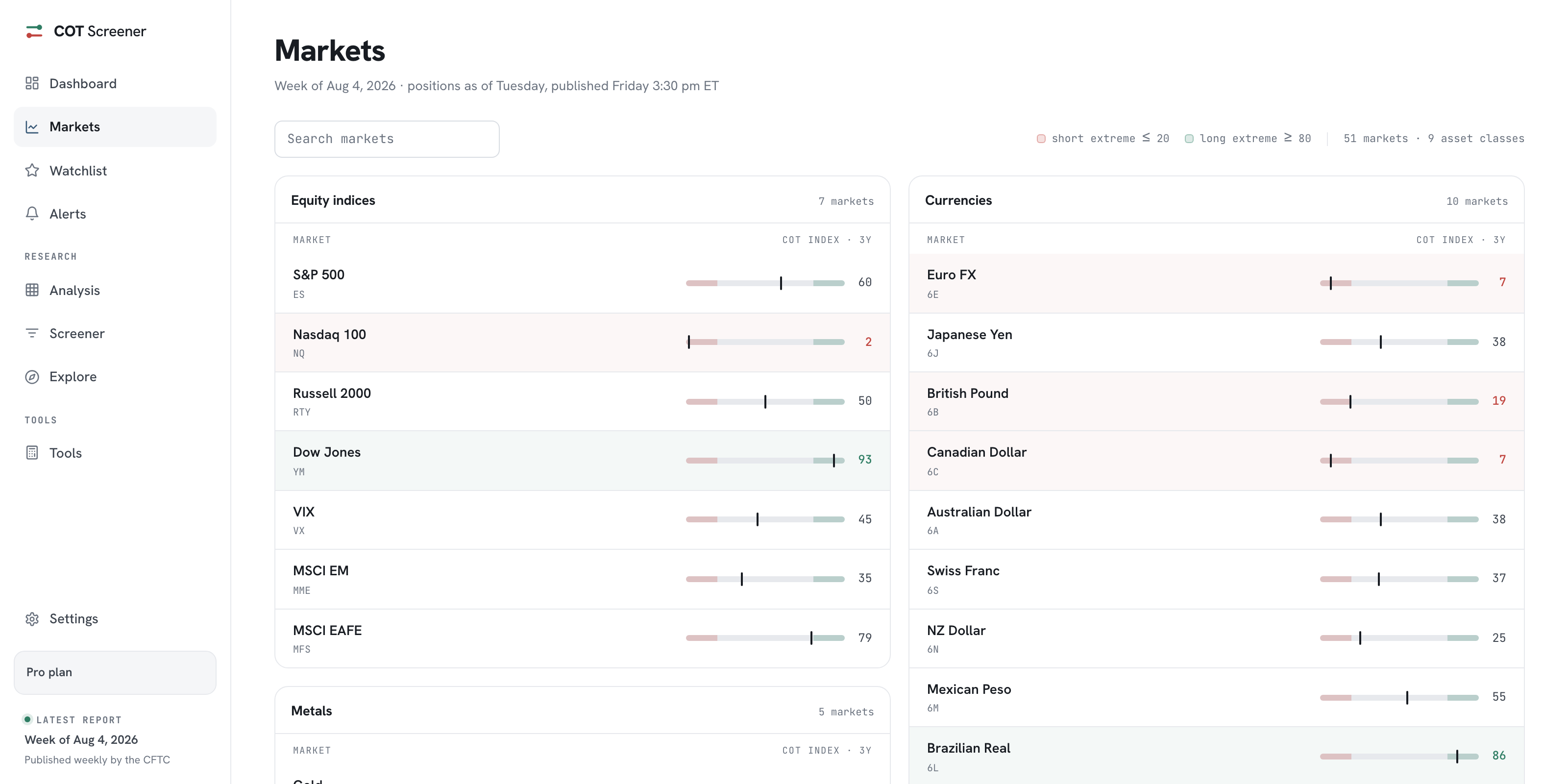
Inside COT Screener
Asset classes: positioning by sector
Sometimes the market worth reading is not a market at all, but a whole sector. This view compresses each asset class into one card: its average stance, its spread and its extremes.
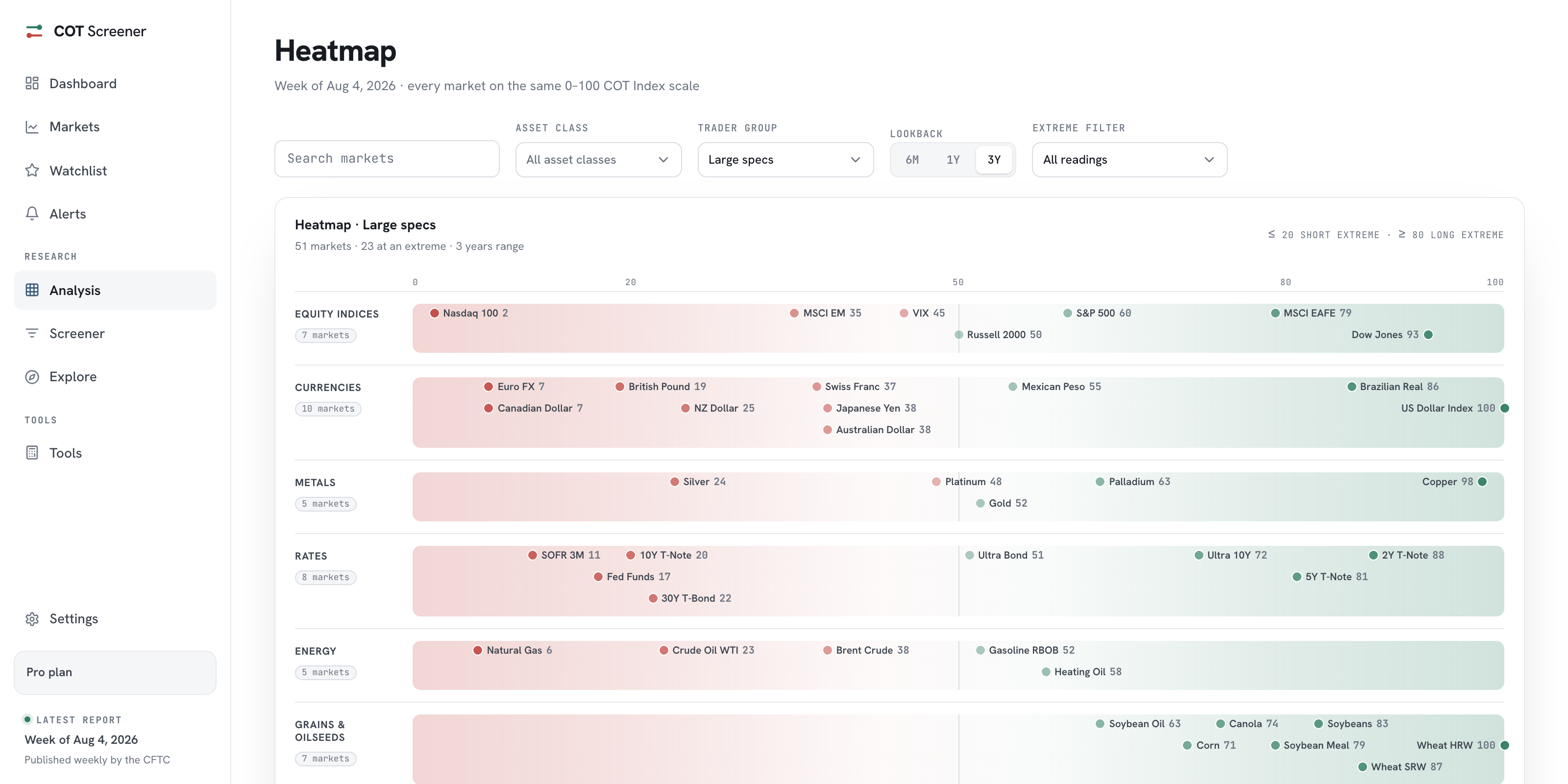
The heatmap keeps every market visible. This page deliberately gives that up. It asks what each class is doing as a whole, and answers with nine cards, one per class. The screenshots show the week of August 4, 2026.
Anatomy of a card
Three layers, top to bottom. The header states the class, its market count and how many sit at a long or short extreme. The coloured chip is the class average on the 0 to 100 scale of the COT Index. The histogram spreads the markets across five 20-point bands, from short extreme to long extreme. Below it, every market appears as a chip with its reading, coloured by where it sits.
The average is the headline, the histogram is the honesty. In the week shown, crypto averaged 99 with both markets in the top band, a class in full agreement. Equity indices averaged 52, but the histogram spread across all five bands, from Nasdaq 100 at 2 to Dow Jones at 93. Same middle-ish average, opposite story.
Reading it as a routine
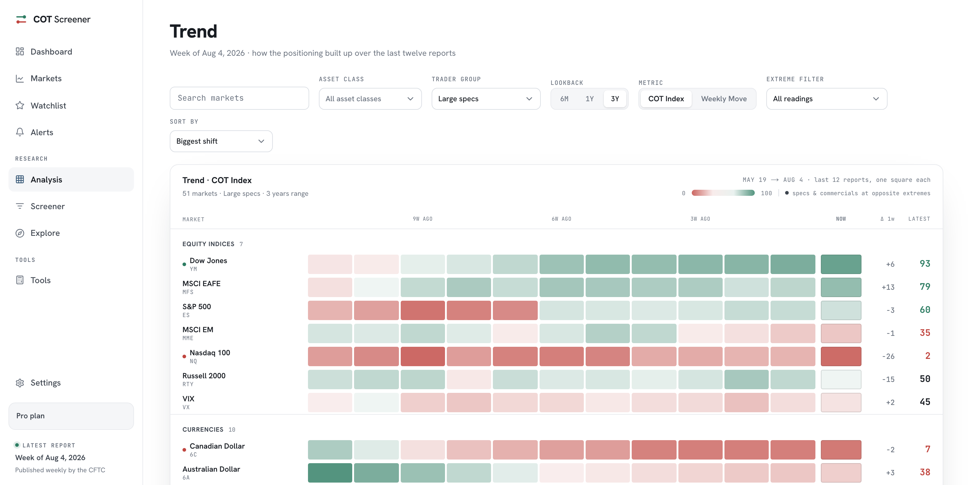
The card layer answers the first question of the week: which corner of the futures universe is stretched. A class with a one-sided histogram and a high extreme count deserves the next click. From there, the chips link into each market’s full analysis, and the trend view shows whether the class moved there this month or has been parked for a quarter.
The controls above the cards match the rest of the section: search, asset class, trader group and lookback, plus the sort menu. Switching the trader group to commercials flips the picture, since hedgers usually stand on the other side. The commercials guide explains that mirror.
Common questions
What exactly does the average mean?
It is the plain average of the COT Index across the class's markets, on the lookback you picked. It summarises the stance; the histogram below it shows whether the markets actually agree.
Why do the bands matter if I have the average?
Because two very different classes can share one average. Markets split between both extremes average out to the middle. The five bands make agreement and disagreement visible.
Which classes exist?
Nine: equity indices, currencies, metals, rates, energy, grains and oilseeds, softs, livestock and crypto. The count of markets per class is printed on each card.
Can I reorder the cards?
Yes. The default order is by category. The sort menu also ranks classes by their reading, so the most stretched class moves first.