Inside COT Screener
The COT heatmap: every market on one scale
Tables rank one number at a time. The heatmap does something a table cannot: it shows where every market sits on the same scale, at once, before you have read a single value.
The heatmap is the first page of the Analysis section, and the fastest read in the app. One axis runs from 0 to 100, the scale of the COT Index. Every major market is a dot on that axis, grouped into a strip per asset class. The screenshots show the week of August 4, 2026.
One scale, every market
Each strip is one asset class, from equity indices to crypto, with its market count on the left. A dot’s position is its COT Index, and its label carries the exact value. Colour repeats the position, red toward the short end and green toward the long end, so clusters read from across the room. The shaded zones past 20 and 80 mark the extremes.
The header line above the heatmap counts what you see. In the week shown it read 51 markets, 23 at an extreme, on the three-year range. That one sentence is the week’s temperature before any detail.
Read the strips for shape, not just for single dots. In the week photographed, every grain and oilseed sat in the upper half, while all three livestock markets sat below 25. One stretched market can be noise. A whole class at one end is a stance.
The filter bar
Five controls sit above the heatmap. Search narrows by name. The asset class menu keeps one strip. The trader group menu redraws the heatmap for large speculators, commercials or small traders. The lookback switches the scoring window between six months, one year and three years. The extreme filter keeps only markets at or past 20 and 80, which empties the middle and leaves the candidates.
From the overview inward
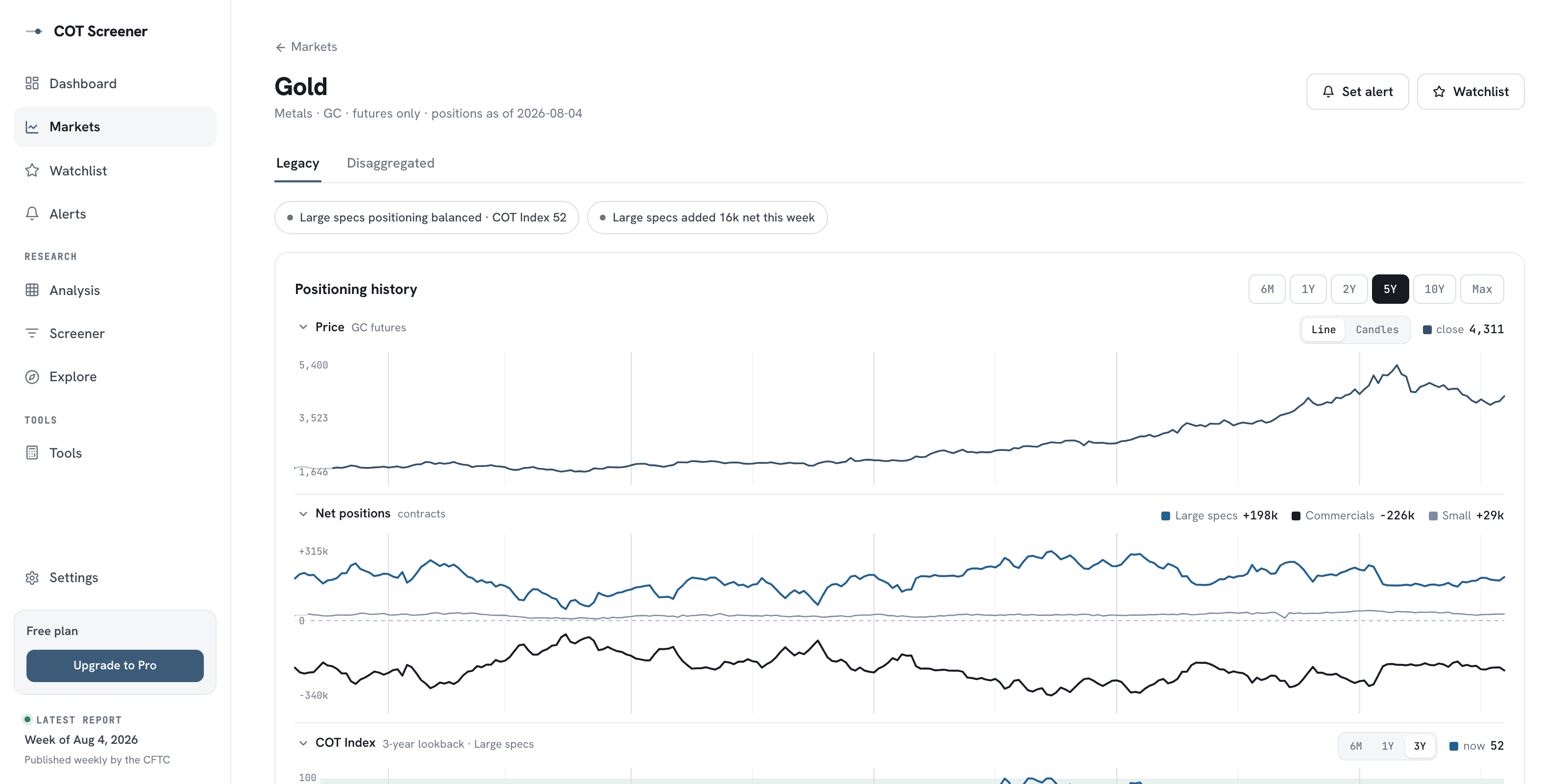
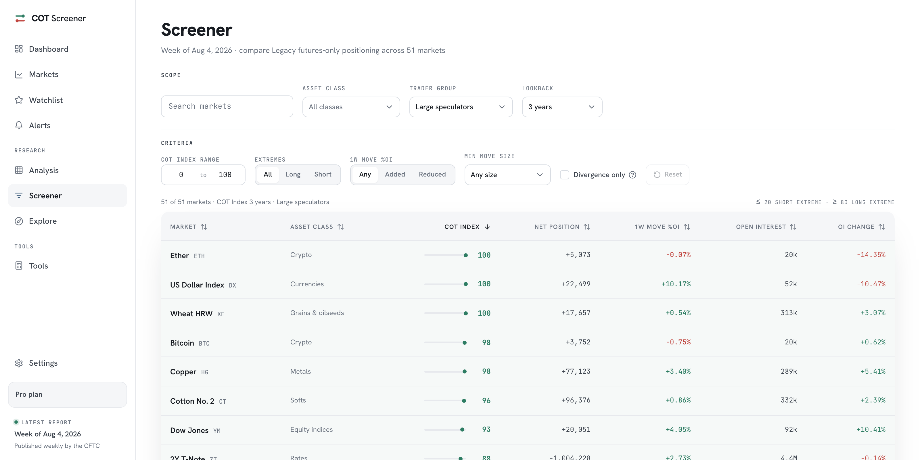
Every dot is a door. Clicking one opens the market’s full analysis, with the history behind the reading. When a scan raises a precise question, such as which of these extremes also added this week, the screener turns it into a filtered list. The heatmap finds the corner; the other pages interrogate it.
Common questions
What do the colours mean?
Position on the scale, not judgement. Dots shade red toward 0, the short end, and green toward 100, the long end. The bands past 20 and 80 mark the extreme zones.
Can I look at commercials instead?
Yes. The trader group menu switches the whole heatmap between large speculators, commercials and small traders. Commercials usually mirror the speculators, which the commercials guide explains.
Why do readings change when I switch the lookback?
Because the COT Index is relative to a window. A net position near its six-month high can be mid-range against three years. The COT Index guide walks through the formula.
Where does the analysis section keep its other views?
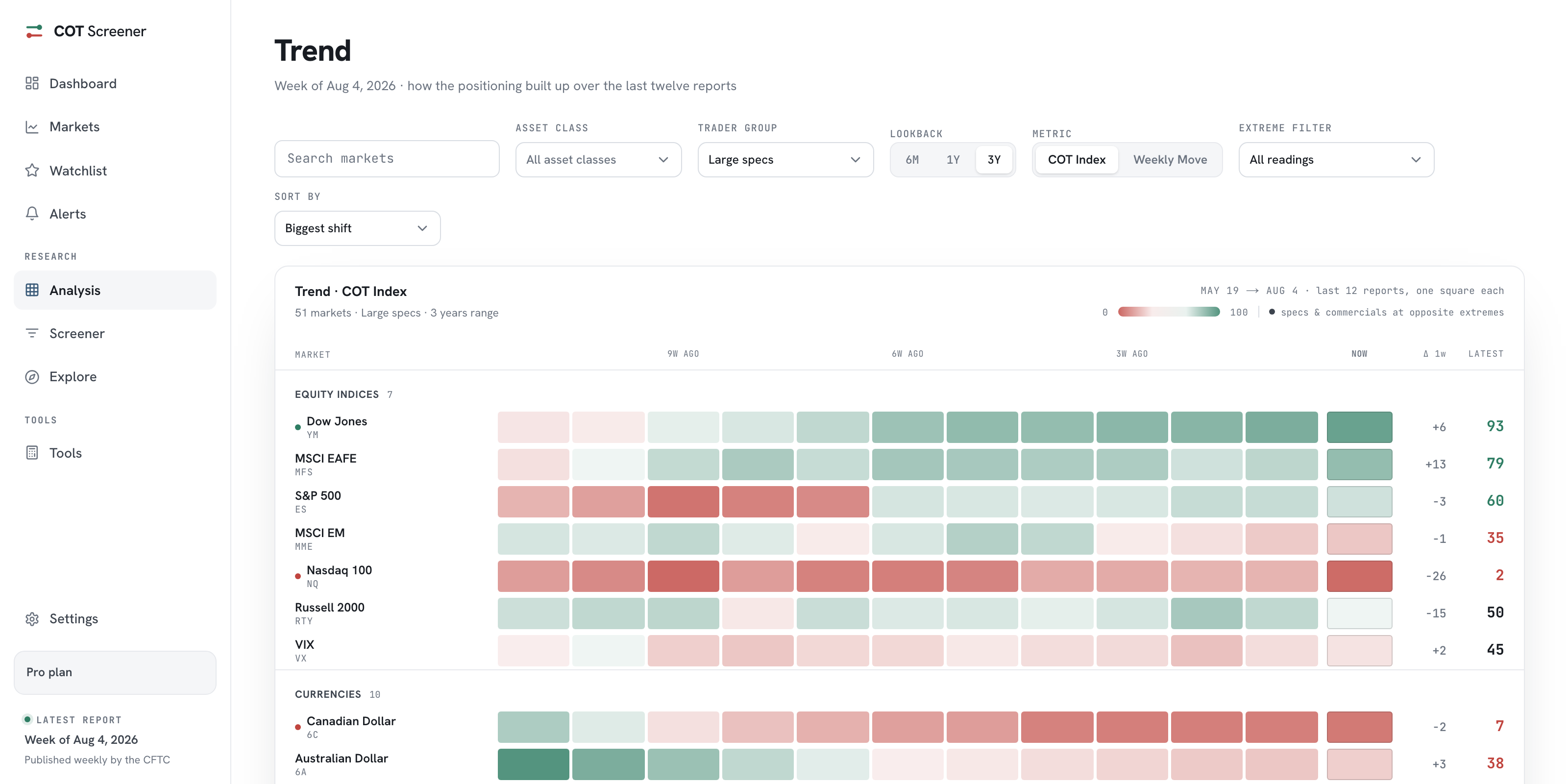
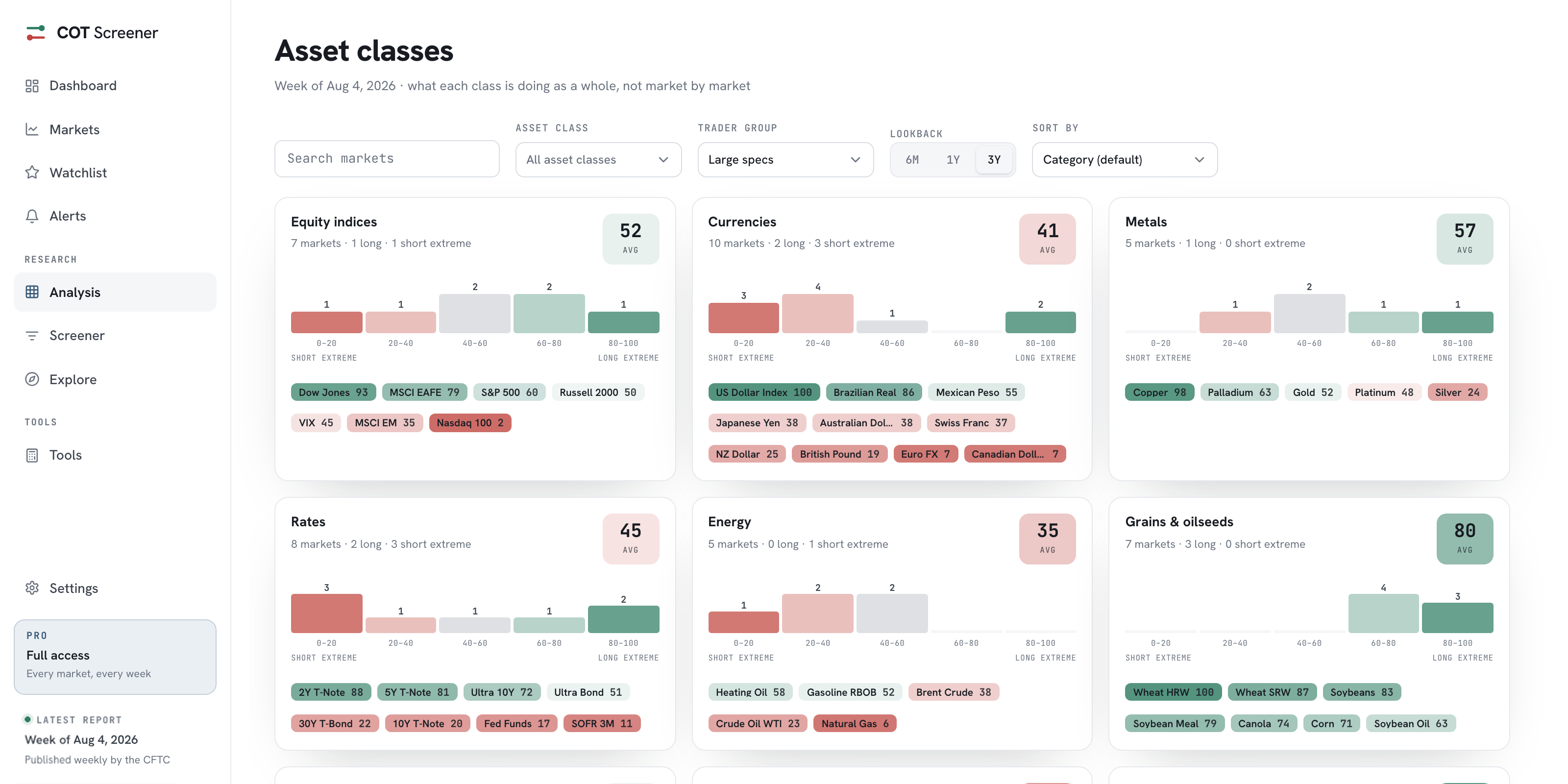
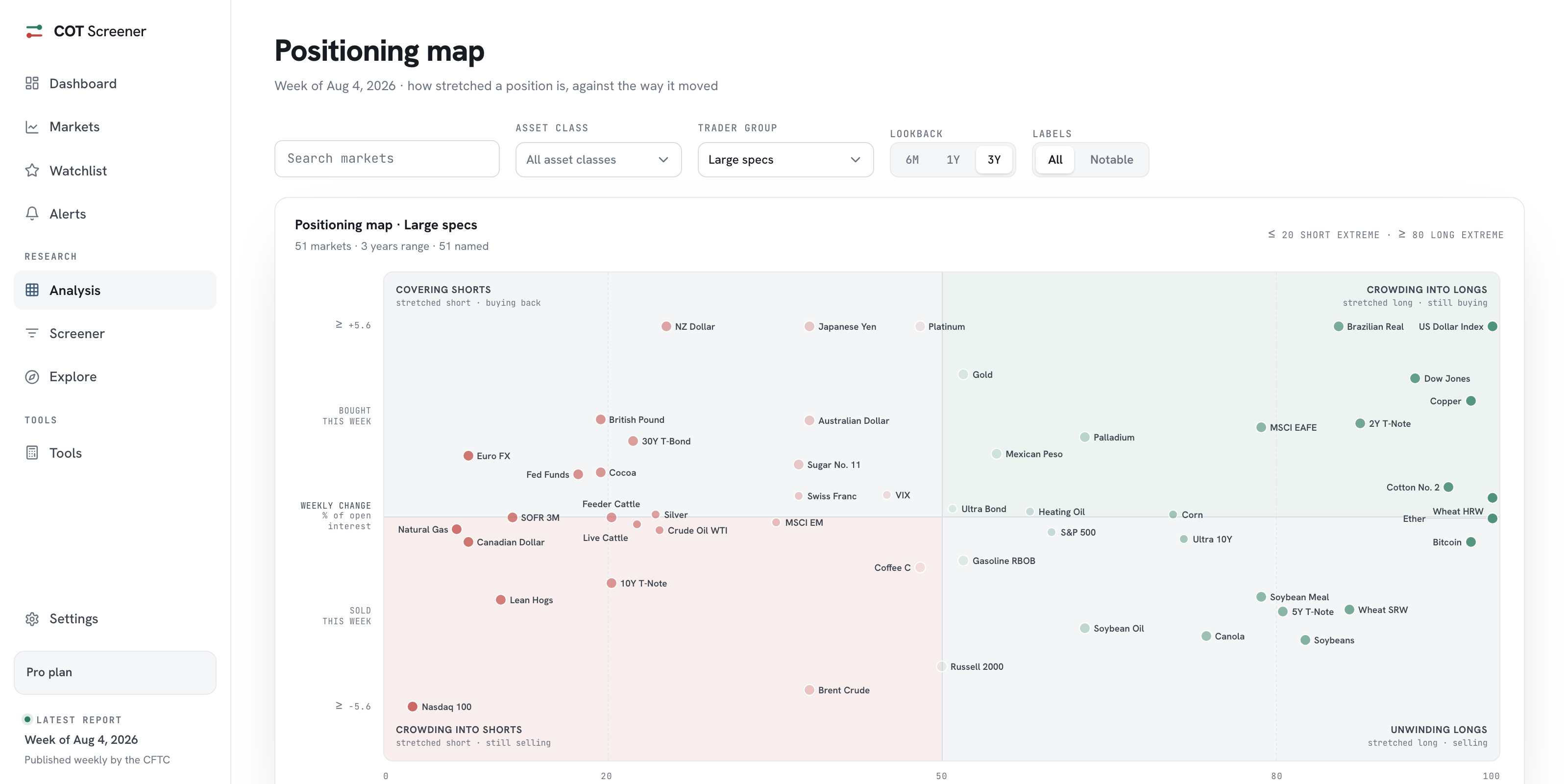
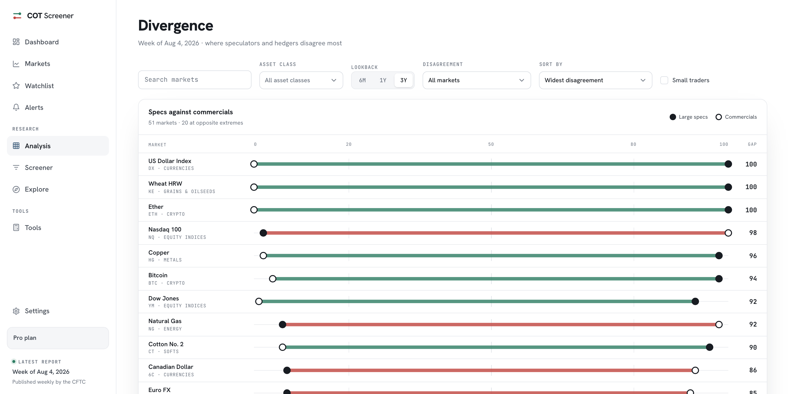
The heatmap is the first of five pages under Analysis. The others are trend, asset classes, the positioning map and divergence. Each reads the same week differently.